Constraint Layout is Google’s answer for nested layouts that take a while to layout if they get complex. It allows you to express complex layouts at a single level, making it much faster to draw the layouts, as well as allowing you to perform animations and being much easier to use than creating custom view groups.
Layout Height / Width
You might be used to using match_parent and wrap_content everywhere, and while you can still use those, with constraint layout there’s a new one – match_constraint. When you set the width or height of a view to match_constraint (by setting it to 0dp), the view will expand to resolve the constraints. If you have constraints on a view and set it to wrap content – for example you constraint the start and end to the parent but the width of the view is wrap content – those start and end constraints become ‘inequality’ constraints. If you’re from iOS you’ll be familiar with this, but essentially what you’re telling the algorithm is that the view can be any size smaller but cannot be larger than the constraints minimum value.
Chains
Constraint Layout has the concept of ‘chains’. These essentially replicate the layout behavior of a linear layout by allowing you to group a bunch of views together either vertically or horizontally. Each chain group has a head – in a vertical chain this is the top -most view, and in the horizontal chain it’s the left-most view. All views in the chain follow the head. However, each view is still in control of it’s width and height, as well as positioning in the opposite direction of the chain (e.g. if a view is in a vertical chain, each view needs to have constraints set horizontally which can be individually set per view, and the opposite for a horizontal chain).
There are a few types of chain style. The first is inside spread chains. Inside spread chain works by taking the last head and tail views of the chain and positioning them at the end of the parent, then evenly dividing up the space between them and sharing this out between each of the inner views, which are placed centrally inside their own given space.

The second type is just spread chain. Spread chain works in a similar way, except the head and tail are positioned centrally in their space like each of the inner views in the chain, rather than being pinned to the outer edges of the parent.

A thing to note here is that if you have an inside spread chain or just a regular spread chain and apply weights to it (which work almost exactly as how they work in a linear layout), the two chain styles will work in the same way.
The final chain style is a packed chain. A packed chain pushed all the views within the chain together. They are all the centered within the constraint.

You can create your own chain easily by selecting all the views you want included in the chain and right clicking to select the ‘chain’ menu
Bias
Bias is a concept in Constraint Layout which lets you constraint a view’s start and end edges to its parent or another view, and then specify a bias percentage in either direction. For example, you have a view which has both its start and end edges pinned to its parent. This will automatically center that view within the parent.

A bias of 0 will shift the view all the way to the left and 1 will shift it all the way to the right. When the view is centered like above, it intrinsically has a 0.5 bias. If we change this value to 0.25, the view will shift to the left.

This is specified in XML like this:
app:layout_constraintHorizontal_bias=”0.25″
Bias can be applied to views, chains, layouts, among others. But instead of constraining a view’s start and end and then setting a bias to get it where you want every time, you can instead use guidelines.
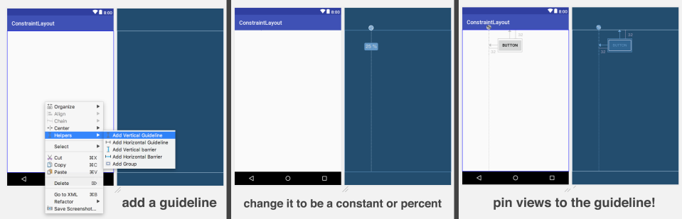
Guidelines
Guidelines are a concept that allows you to create a ‘virtual’ line in your layout in order to pin your real views to it. You can create either a vertical or horizontal guideline in the blueprint view by right clicking and selecting the ‘Helpers’ option. You can then move then around your view or click the circle to change them from being a constant value from the start or end edges of your parents to instead being a percentage value.
Guidelines show up in your XML but have an empty onDraw() method and have a fixed visibility of View.GONE. It will be present during the onLayout phase though, allowing other views to be pinned relative to them.
Dimensions
In addition to setting a fixed width and height, you can specify an aspect ratio for a view, which it will always respect. This is especially useful for image views. If you know all your images that you will be displaying have the exactly correct size, you can just use wrap_content and it’ll be fine. However, if your images are coming from an online source and you can’t be sure of the size, you can use an aspect ratio. To do this, select a view and in the square box where you can see your set constraints (directly underneath its ID), notice in the top left corner of this box is a triangle. Click that and a text box will appear, allowing you to enter your aspect ratio.
You can also define an aspect ratio in the XML, by adding this attribute:
app:layout_constraintDimensionRatio=”w,4:6″
What this means is that when the view’s width is 40, the height should be 60. You can change the w to a h and specify that when the view’s height is 40dp, the width should be 60dp. Now you can pin this view’s edges and set its width and height to 0dp for match_constraint.
Barrier
Barrier is a new concept added in version 1.1 of ConstraintLayout. Barrier is somewhat similar to guidelines, except rather than YOU specifying where the line is, the line is calculated from the views in protects. You create a barrier by right clicking and going to Helpers. You can have a vertical or horizontal barrier, which will create a new view in your XML. From here, add all your views as a child of this new object. The barrier will find the largest view, respective to whether it’s a horizontal or vertical barrier, and create a new guideline. Now you can constraint other views to that barrier guideline and be sure that the views inside the barrier and view outside the barrier will never overlap.
Group
A group allows you to, basically, group a bunch of views together. This lets you call View.GONE on the group and everything in the group will be gone. The group itself isn’t drawn, it’s just a concept like real-life country borders.
Animation
One of the more interesting things about Constraint Layout is its ability to animation between constraint sets automatically. To do this, you need to create two XML layouts, both with the same views with the same IDs, but with different constraints. Now animating between these constraint sets is super easy. First you need to grab a reference to your original constraint layout with findViewById. Then you copy the constraints from a different XML file and apply them to your constraint layout reference.
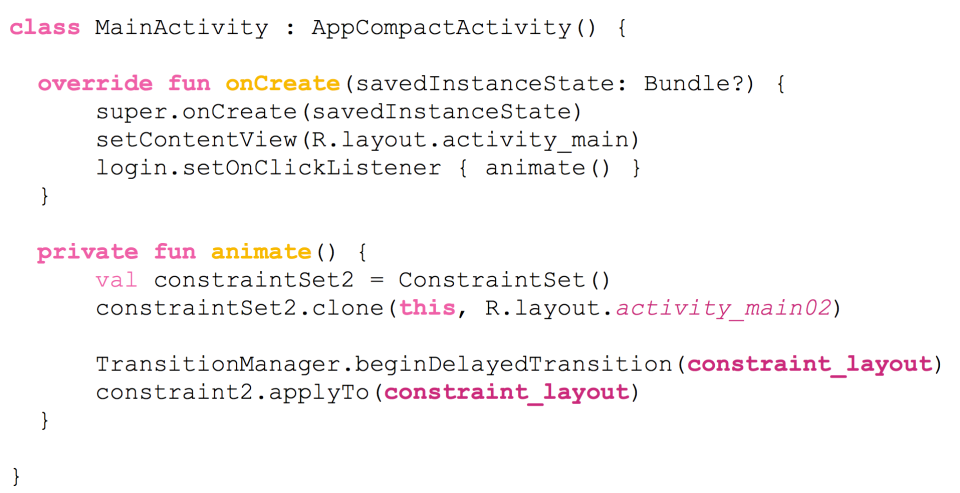
And that’s all the code needed to perform a basic animation between the two constraint sets. You can also have a totally different constraint set applied in landscape than in portrait with this method, if you wanted. An important thing to note here though is that you need to have the same IDs in both layout files for this to work.
 JORDAN DIXON